

The Problem
Reorder Divi 5 Columns on Mobile
A desktop hero places text beside an image, but the phone layout stacks the image first when you want the text first. Duplicating modules and hiding one copy on each device creates extra content to maintain. Divi 5’s Display Order can change the visual order at smaller sizes.
The Fix
Step 1
Identify the columns
Open the page in the Visual Builder. Select the row and identify the columns that need a different order when the layout stacks on smaller screens.
Step 2
Choose the phone breakpoint
Use the responsive selector in the top bar to switch to Phone. Confirm that the row is stacked at this view; adjust its responsive column structure first if it is not.
Step 3
Set each column’s Display Order
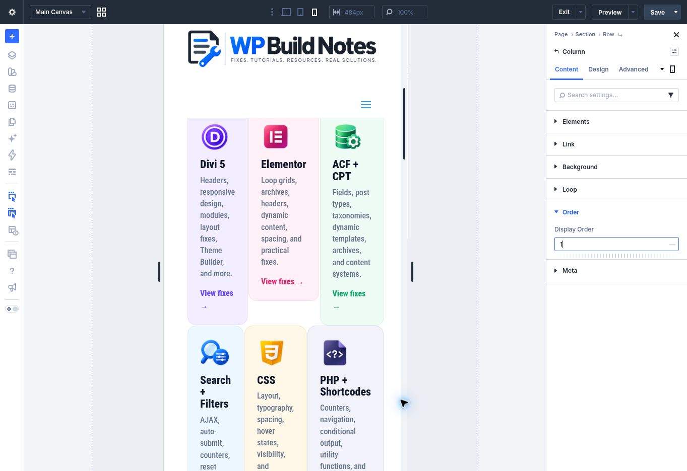
Open the first column’s settings and find Display Order. Give the column the intended order, then repeat for the other columns. Use a clear sequence such as 1, 2, 3.
Step 4
Check tablet and desktop
Switch through Tablet and Desktop. Confirm the phone-specific order gives the intended reading sequence and that larger layouts still look right.
Step 5
Save and test the page
Save, then preview the live page at a narrow phone width. Check that headings, images, buttons, and links appear in a sensible reading order.
Quick Summary
Visual Builder → select Phone → open each Column’s settings → set Display Order → review Tablet and Desktop → save and preview.
Troubleshooting
Nothing moved
Check that you changed the setting on the column, not the row, and that the selected breakpoint is Phone.
The wrong content comes first
Set an explicit order on every column in the row. Avoid leaving the other columns with conflicting order values.