
The Problem
Build Responsive Card Rows with Divi 5 Flexbox
A row of cards looks fine on a wide screen but becomes squeezed or overflows when the viewport narrows. Divi 5’s Flexbox layout can wrap child elements onto additional lines when the row no longer has enough room.
The Fix
Step 1
Select the card row
In the Visual Builder, select the row that contains the cards. Confirm each card is a direct child column or child element of the row so the row’s flex settings can arrange them.
Step 2
Enable Flexbox for the row
Open Row Settings and go to Design → Layout. Choose the Flexbox layout option. Keep the layout direction set to Row for a left-to-right card line.
Step 3
Allow the items to wrap
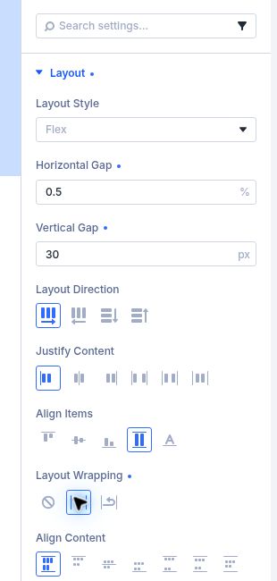
In the row’s flex layout options, set Layout Wrapping to Wrap. This allows items to move onto additional lines when the available width is too small.
Step 4
Set space between cards
Use the row’s Horizontal Gap to control space between cards in the same line and Vertical Gap to control space between wrapped lines. Adjust alignment if the wrapped cards need a different position.
Step 5
Review each breakpoint
Use the responsive device selector to inspect Desktop, Tablet, and Phone. If cards remain too narrow, adjust the column sizing or responsive structure at that breakpoint, then save and preview the live page.
Quick Summary
Select the Row → Design → Layout → Flexbox → set direction to Row → Layout Wrapping: Wrap → tune Horizontal Gap and Vertical Gap → check each breakpoint.
Troubleshooting
Cards still overflow
Confirm wrapping is set to Wrap on the row that directly contains the ca