
The Problem
Adjust Divi 5 Spacing for Tablet and Mobile
A section looks balanced on desktop but feels cramped on a phone, or has too much empty space on a tablet. Changing the default spacing can affect every screen size. Divi 5 lets you choose a device view first, then edit spacing for that breakpoint.
The Fix
Step 1
Open the page in the Visual Builder
Open the page you want to adjust and enable the Divi 5 Visual Builder. Start with the section, row, column, or module whose spacing needs attention.
Step 2
Switch to the target device
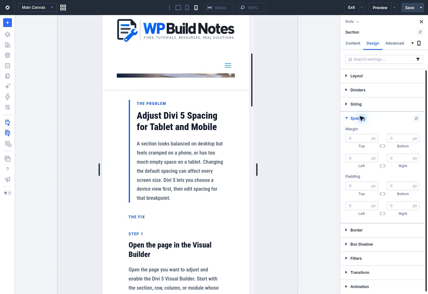
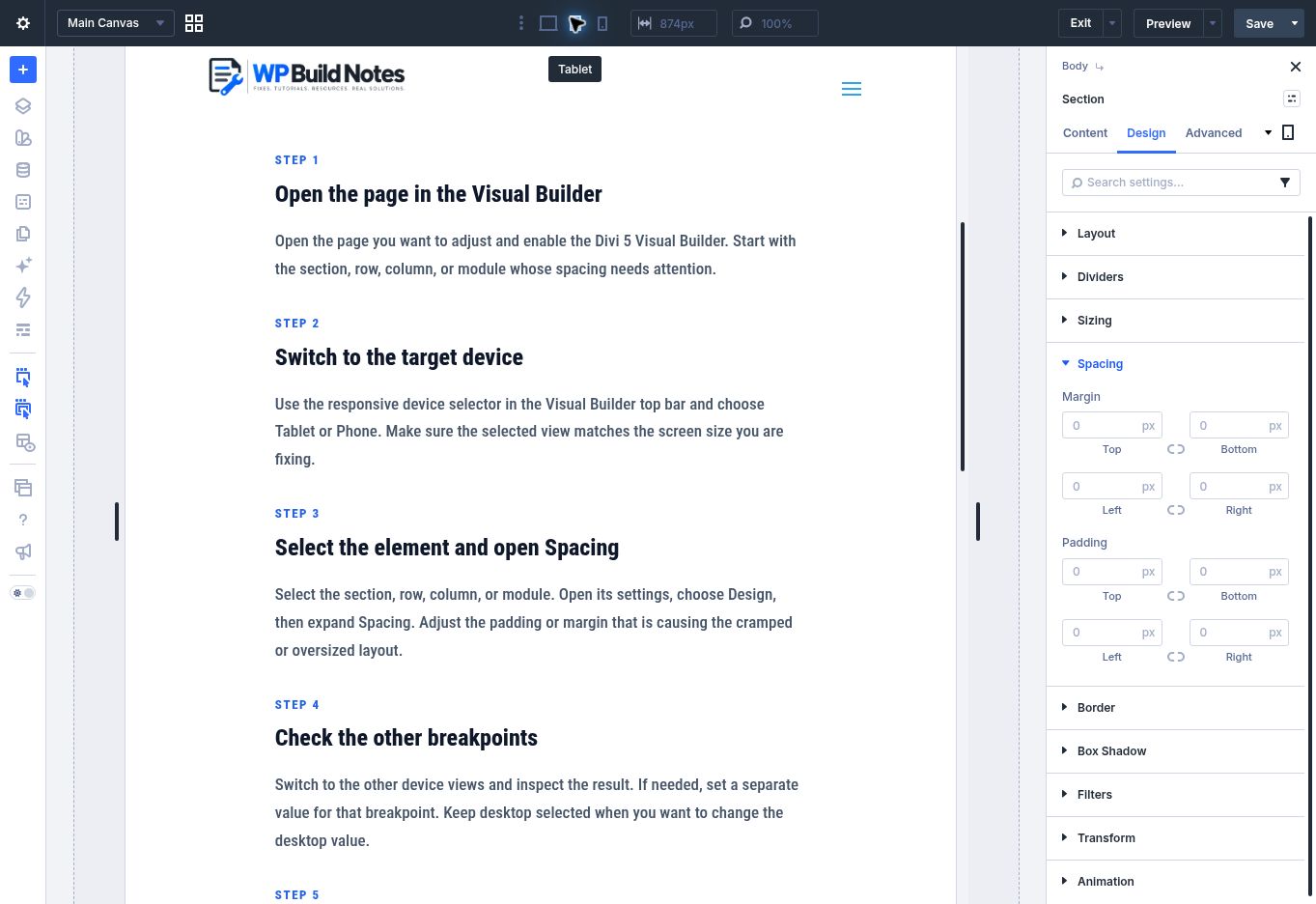
Use the responsive device selector in the Visual Builder top bar and choose Tablet or Phone. Make sure the selected view matches the screen size you are fixing.
Step 3
Select the element and open Spacing
Select the section, row, column, or module. Open its settings, choose Design, then expand Spacing. Adjust the padding or margin that is causing the cramped or oversized layout.
Step 4
Check the other breakpoints
Switch to the other device views and inspect the result. If needed, set a separate value for that breakpoint. Keep desktop selected when you want to change the desktop value.
Step 5
Save and check the front end
Save the page, then preview it at desktop, tablet, and phone widths. Check both the outside spacing around the element and the space inside it.
Quick Summary
Visual Builder → choose Tablet or Phone in the device selector → select the element → Design → Spacing → adjust padding or margin → review all device views.